Redesigning

PhonePe
Karte Ja. Badhte Ja
PhonePe is a mobile payment platform using which you can transfer money using UPI, recharge phone numbers pay utility bills, etc.
Problem
PhonePe stands first in our list of best UPI apps in India. It is a revolutionary app that made the Indian population start trusting and moreover making online mobile payments. So being such a revolutionary app with 35 crore users I find certain core experiences lacking which can help attract even more people to use the app and the overall experience of the user becomes less complicated


What i did and what i learned
REDESIGNING PHONE PE
I adopted design thinking approach for the problem
Define
Ideate
Prototype
Evaluate


UNDERSTANDING THE USER
Conducted a heuristic evaluation with four phone pe users and asked them to rate each feature out of 10 and state their reasons for it in order to identify their pain points
User
Understand
Consistency and standards
Recognition rather than recall
Flexibility and efficiency of use
Aesthetic and minimalist design
Help and documentation
User 1
5
8
5
6
7
7
User 2
4
9
6
5
6
6
User 3
6
8
5
6
5
6
User 4
5
8
7
6
6
5
PAIN POINTS

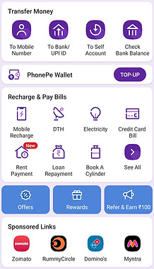
Scan button was difficult to find easily because it is crowded with other elements


The homepage contains all elements which are also there in the bottom navigation which is unnecessary
Stores, insurance, and investments which are not commonly used features are placed in the navigation giving it more importance

All elements are given equal importance, no hierarchy. so difficult to easily choose what is needed easily. Overwhelming to the eyes
More importance should be given to money transfer which is the primary function


Add shortcut option is to add shortcuts to phones' homepage. it would be better if user can add shortcut to apps homepage
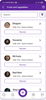
The filters number is so out of place with the design. Doesn't match with the design system of the app

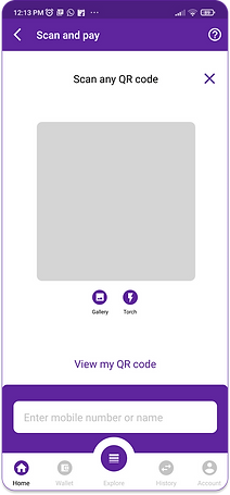
The scan area doesn't have the option to quickly send money to number if the scan is not needed or working
CURRENT USER FLOW
.jpg)
.jpg)
.jpg)
ME
Key factors for redesign
-
QR code is not easily accessible
-
Reduce too much content in homepage
-
Redesign the stores page
-
Users QR code is difficult to find
-
Remove repetitive elements
-
frequently-used user is not shown anywhere
* Red indicated elements are to be rethought about.
WIREFRAMES


Basic wireframes


Homepage

Explore

Scan

Stores

Contact page
ANALYSIS
PAIN POINT 1
SOLUTION

Scan button was difficult to find easily because it is crowded with other elements

Most frequently used elements are placed according to thumb zone heat mapping.

Placed the scan button giving in it more importance in the natural area for easily using it with one hand
PAIN POINT 2
SOLUTION

.png)
The filters are given more importance and neatly placed and matched it with the design system of the application
The filters number is so out of place with the design. Doesn't match with the design system of the app
.png)
PAIN POINT 3
SOLUTION


The homepage contains all elements which are also there in the bottom navigation which is unnecessary

Added only very commonly used and important elements in the navigation bar
PAIN POINT 5
SOLUTION

All elements are given equal importance, no hierarchy. so difficult to easily choose what is needed easily. Overwhelming to the eyes

Grouped all the secondary elements in the explore section of the navigation. so the layout is clean and clear
PAIN POINT 7
PAIN POINT 4
SOLUTION

More importance should be given to money transfer which is the primary function

Made the money transfer button the primary button. When clicking the primary button the options to send money appears.
PAIN POINT 6
SOLUTION

The scan area doesn't have option to quickly send money to number if scan is not need or working
.png)
Added and option in the scan where user can enter phone number to quickly send money from the same screen
SOLUTION

Add shortcut option is to add shortcut to phones homepage. it would be better if user can add shortcut to apps homepage
Gave an option to add the contacts s a shortcut to the apps homepage so the user can directly click the contact from the homepage the next time


USABILITY TESTING
First click testing
Users were told to click on the inteface in order to complete the intended task and thus the effectiveness of the app can be evaluated
Heat map generated


Right click
Wrong click
Right-click and wrong click identified based on the prompts given to the user
.png)
.png)

Insights
-
Users find it easier to identify elements that are different from others.
-
From a business perspective, new updates or ideas added to the application if given in the explore section will not reach a lot of users.
-
Users take some time to realize there are things inside the explore section.
-
Phone pe wallet top-up is hidden inside the explore section. users tend to click the icon of wallet to recharge it
USER REVIEWS

Adding all secondary elements to the explore section is good, but sometimes for a first-time user it's not that easy to find those elements first
So much simplified version of the existing app. all elements beautifully placed according to the importance
.jpg)

easy to use, now I can easily find the scan button and now the app is less overwhelming
Adding option in scan page to send money to mobile number is good and I have seen the same in Paytm and I think that is more usable reducing the time clicking back and forth

Learnings
-
Fitts law: The position of a feature plays a greater role. features that are to be used frequently should be placed in a very easily accessible position.
-
Choosing from a few options is always better than having a lot of options
Future steps
-
Due to limited data available the research is limited to a smaller user audience. More extensive research and deeper analysis need to be conducted in order to refine and validate the design solutions.
.jpg)


